PROJECT
Redistricting Report Card
2021
Technologies: React, D3.js, Gatsby, Netlify, Airtable, S3
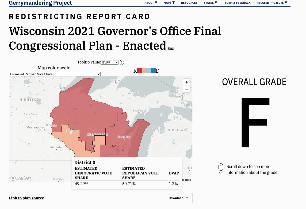
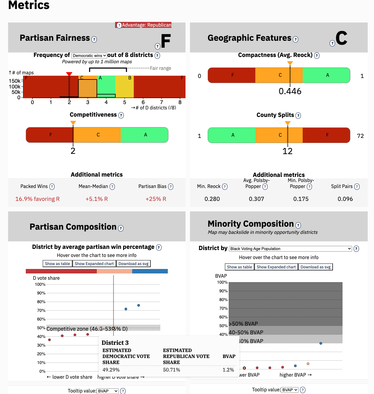
I built this entire interactive data visualization: the Mapbox styling, the tooltip that persisted across the page, and each of the charts (in D3). The charts had to fit everything from New Hampshire congressional map to the Texas State Legislature.
I also built out the deploy pipeline (Airtable => S3 => Github => Netlify) so this could be produced live during the redistricting cycle.

